← Heatmap Visualization for Distributions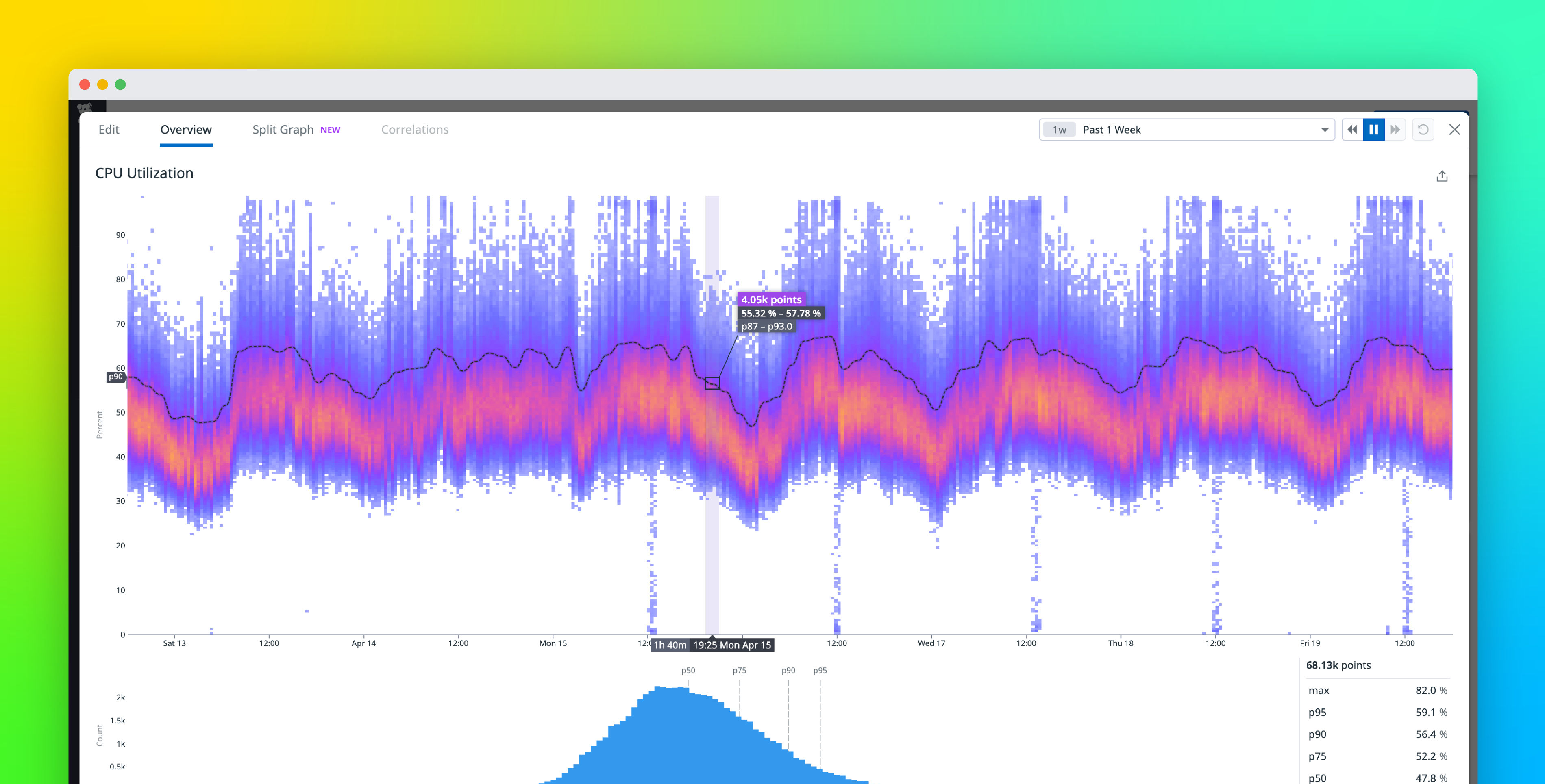 Read the original post ↗
How we built the Datadog heatmap to visualize distributions over time at arbitrary scale | Datadog
5/1/2024 · Joe McCourt, Sagar Mohite, Austin Lai
What this post added
This post details the engineering decisions and technical implementation behind Datadog's heatmap visualization for distribution metrics. It explains the use of DDSketch for scalable data aggregation and a frontend approach that limits the number of bins to achieve constant-time rendering. The core contribution is the development of a visualization that reveals distinct data distribution 'modes' over time, offering a more nuanced understanding of system performance compared to traditional percentile graphs.