Visualizing Friendships
Dec 14, 2010Paul Butler
Summary
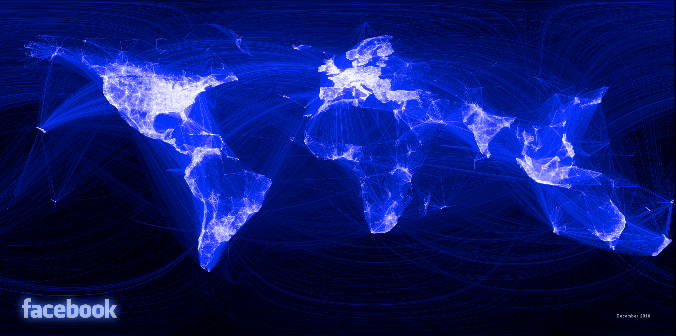
This post details the process of visualizing friendship locality using data from Apache Hive. It describes sampling 10 million friend pairs, combining this data with user city information to sum friendships between city pairs, and then merging with city longitude and latitude. The post outlines the iterative process of visualization in R, including initial attempts with simple line plotting, the challenges of rendering dense data, and the eventual solution of using weighted lines based on Euclidean distance and friendship count, with a color ramp to represent weight. It also mentions replacing lines with great circle arcs for more accurate geographical representation.