Unlocking inclusive design: how Primer's color system is making GitHub.com more inclusive
May 11, 2023Lukas Oppermann, Natalya Shelburne
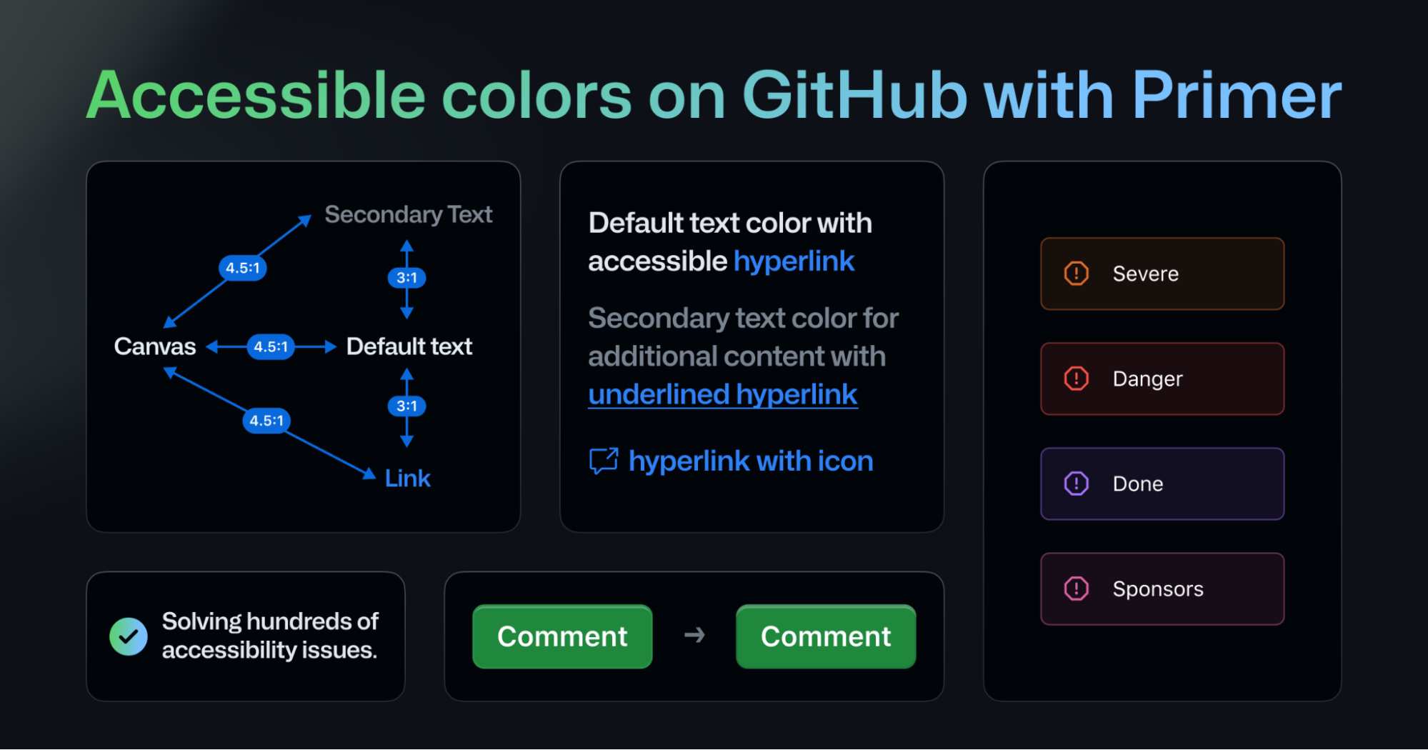
Summary
This post details the engineering effort to improve color contrast within GitHub's Primer design system to meet WCAG guidelines. It covers the audit of color pairs across themes, the development of an automated script to check contrast ratios (including handling semi-transparent colors with a blend algorithm), integration of this script as a GitHub Action for PRs, and a phased rollout using feature flags. The work resulted in resolving hundreds of accessibility issues across over a thousand use cases.
More from the Design System Annotations trail
- Design system annotations, part 2: Advanced methods of annotating components
- Design system annotations, part 1: How accessibility gets left out of components
- Considerations for making a tree view component accessible
- Design's journey towards accessibility
- Creating an accessible search experience with the QueryBuilder component