Pragmatic Redesign for GitLab
Jan 16, 2015Dmitriy, Job
Summary
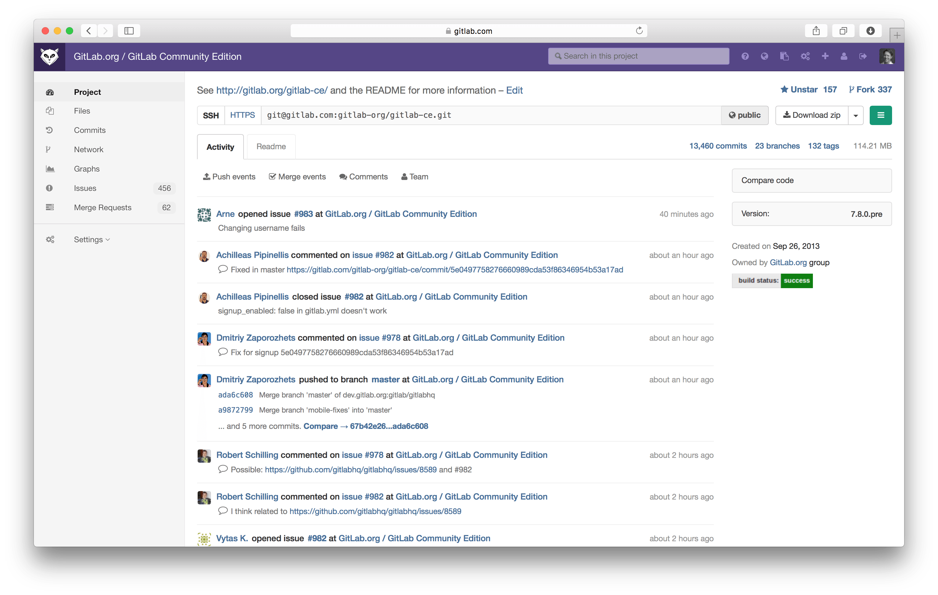
This post details the initial redesign of GitLab's UI navigation to address specific usability problems: limited project navigation space, stacked navigation levels, top-heavy navigation, lack of icon space, and complex settings pages. It describes the prototyping process using browser web inspectors, community feedback gathering via Twitter and a staging server, and the incorporation of contributor merge requests. The final design moved navigation to the side, introduced responsive icon-only states, and eliminated the third navigation level.